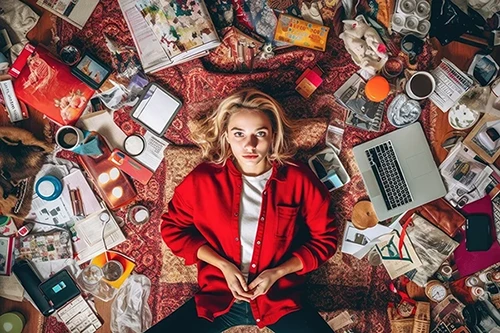
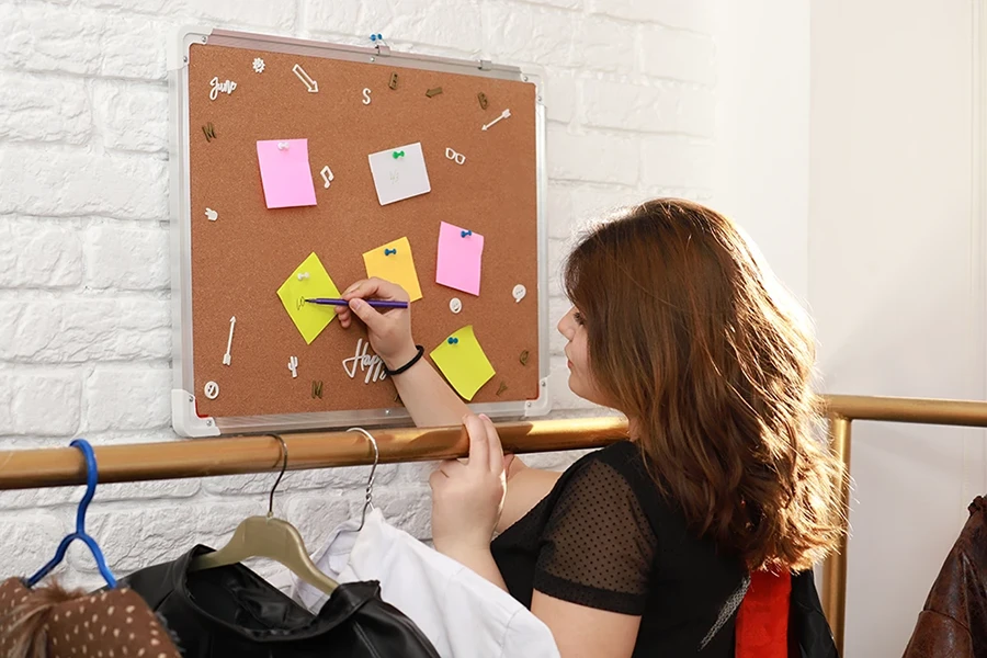
Web and graphic designs don’t always have to be neat and simple. People today are tired of plain websites and simple graphics. They want something that feels human. Something that tells a story. That’s where the Cluttercore trend in web and graphic design comes in. In this style, things feel full, busy, and full of life. It’s about putting a lot of things together in a way that feels fun, real, and personal.
What is the Cluttercore Trend?
The Cluttercore trend in web and graphic design means using lots of different elements in one place. You can think of it like a room full of your favorite stuff, such as pictures, books, colors, and memories, all mixed together.
On a website, this might look like pages with lots of shapes, colors, and pictures layered on top of each other. It doesn’t follow the normal rules of a Phoenix digital marketing agency design. It makes you stop and look.
In graphic design, Cluttercore shows up in posters, ads, or social media posts with mixed fonts, bright colors, and bold visuals. Everything seems loud, but it all fits together. Imagine a flyer with scribbles, stickers, and handwritten notes. It feels alive. That’s the Cluttercore trend in web and graphic design.

Key Features of Cluttercore Trend
The Cluttercore is about embracing chaos. You can find these elements and features:
- Designs are filled with personal touches. It might be hand-drawn art, scanned notebook pages, or old photos.
- Elements often sit on top of each other. Layers make things feel full and interesting.
- Fonts are of different sizes and styles. Some are fancy, some are messy, and some are just weird. That’s the charm.
- The colors don’t match on purpose. You’ll see bright reds, neon greens, and soft blues all together.
- Images come from everywhere. You might see a cartoon next to a photo or a doodle next to a typewriter font.
- Nothing is perfectly lined up. The uneven look grabs your attention and keeps your eyes moving.
- Designs look like someone made them by hand. You can almost feel the human behind the screen.
How to Use the Cluttercore Trend in Web and Graphic Design?
On websites, a digital marketing agency can:
- Skip the straight lines. Make sections slide over each other. Let the pictures spill outside the boxes.
- Use colors that pop, and don’t be afraid to mix.
- Throw in videos, moving text, or little animations. They make the site feel alive.
- Let real people show up. Add photos of customers, drawings by kids, or quotes from fans.
In graphics:
- Add layers. Maybe a photo sits under a transparent pattern, and on top of that is a bold word.
- Mix your fonts. Use a bold one for the title and a handwritten one for the caption.
- Put pieces together like a scrapbook. Don’t try to make it perfect.
- Don’t fix the flaws. Leave a smudge, a tear, or a crooked line to make it feel real.
Click Here to Learn about Our Phoenix Social Media Services
Tips for Using the Cluttercore Trend
- Don’t make it too hard to read or click. Even with all the fun, people still need to use the site or understand the ad.
- Only add things that matter. Even if it looks messy, each part should have a reason.
- Think about the story you want to tell. Let the colors, pictures, and words work together to say something true.
- Check your design on phones and tablets. The fun look still needs to work on every screen.
- Ask friends or users what they think. If they feel excited or connected, you’re doing it right.

How Does Cluttercore Differ from Maximalism?
A digital marketing agency might confuse the two. Maximalism and Cluttercore both love “more,” but they are not the same. Maximalism is bold and rich, filled with gold, patterns, and fancy details. Cluttercore, on the other hand, is about meaning and emotion. It’s personal, made up of your favorite things, even if they don’t match. It feels like home. The Cluttercore trend in web and graphic design isn’t trying to impress. It’s trying to connect.
Cluttercore Web and Graphic Design: Let’s Recap
The Cluttercore trend in web design and graphic design is a feeling. It’s about being honest, fun, and full of life. If you want your brand to feel human and real, this trend is for you. Don’t be afraid to break the rules. People are looking for something real, and Cluttercore gives them just that.
FAQs
What are the most popular colors in 2025?
Rich browns, vibrant reds, cheerful yellows, deep indigos, and natural greens lead the pack.
What is the color theme of 2025?
It’s a mix of bold and earthy tones. Designers focus on warmth, vibrancy, and balance.
What colors match 2025?
Pair earthy shades with bright pops of color for a modern, approachable look.


